Friday, March 31, 2017

It's Editing Time

I absolutely love editing photos, in my opinion this is the time where the photos really come to life. I am obsessed with using the tools available to me on my MacBook, it is the same tools I used to edit the donuts for my table of contents. It allows me to create a masterpiece and it will definitely be useful for future products in this class and others where I need to take photographs.

In my photographs, I wanted to capture things that are the same color or in the same color family in one shot. If you take a look at my previous blog post you can see all the photos pre-editing. So the one below is an image of all the brown ingredients.
The edits I made are:
  • Increased the exposure to make everything brighter
  • Increased the contrast to balance out the exposure increase
  • Removed all the highlights because it gave the photo a weird yellow undertone 
  • Decreased the shadows to prevent the shot from being to dark 
  • Cropped it into a circular shape 

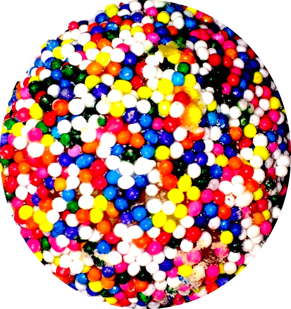
Below is the white ingredients + the cracked eggs. I included the eggs with the white ingredients because there were way more brown ingredients than white so I had to try and balance it out. 

The edits I made are:
  • Slight increase in exposure because this photo was already bright to begin with
  • Decreased contrast because the photo was already bright 
  • The smallest bit of highlight, the yellow highlight complimented the yellow yolks
  • increased shadows to add depth to the whiteness of the ingredients 
  • Cropped into circular shape 
Here are photos of the mixed ingredients:
Edits:
  • Increase in exposure because photo was dull
  • Increase in contrast to balance out the exposure 
  • Remove highlight
  • Remove shadow
  • Crop into rectangular shape to eliminate excess background 
Edits:
  • Increase in exposure because photo had an ugly undertone
  • Did not change contrast 
  • Remove highlight because it made it look more appetizing 
  • Remove shadow because it made it look more appetizing 
  • Crop into a cleaner rectangular shape 

French toast cups pre oven :


Edits:
  • Increase in exposure to brighten the image up also to show more detail 
  • Slight decrease in contrast to even out the exposure 
  • Add highlight to help show color of bread
  • Increase shadow to make the color of the pan pop!
  • Crop into cleaner rectangular shape 
French Toast cups post oven : 


Edits:
  • Slight increase in expose to make it look visually pleasing 
  • Increase in contrast to make bread look crispy
  • Add highlight to show to perfect baking job I achieved ;)
  • Remove shadow 
  • Crop into cleaner rectangular shape 
French toast cups out of pan with syrup:

Edits: 
  • Increase in expose to make the food look more appetizing 
  • Increase in contrast to show depth of colors
  • Add highlight to make photo look more professional 
  • Increase shadow to balance out exposure
  • Crop into cleaner rectangular shape 
WOO so that's all my photos, stay tuned for the finished product of my two page spread!


Thursday, March 30, 2017

More facts

Throughout the entire journey to Blissful Bites, I wanted each of my decisions to revolve around my target audience. Now, to go back to the the mindset that simplicity is better, I found this article that helped verify my thought process. It gives reasons how simple designs are timeless, to elaborate, it makes these powerful points:
  • fewer distractions
  • information is clear
The working mother likes when things are made easier, and that is something I will value throughout the duration of my project.
"Simple design is popular because simplicity looks mind-blowingly good"

Source cited:
"Beauty in Simplicity: Why Good Design Is Timeless." Fresh Consulting. N.p., 30 Dec. 2016. Web. 13 Apr. 2017.

FUN PAGE

THIS IS PAGE 2 OF MY MAGAZINE, it is going side by side with my table of contents. It is used to promote my two page spread. I kept it vibrant and simple because those are conventions of a food magazine. Stay tuned guys, Blissful bites is getting even better. 

Wednesday, March 29, 2017

Its Picture Time

As soon as I got home from school I wanted to begin baking because I bought all the ingredients yesterday. So, I got home, changed into clothes I can get dirty, and began baking. During the baking process, I needed to capture many different photographs to use in my two page spread. I wanted the background of all the photos to be white, like I said in an earlier post, because the color of the two page spread itself is going to be tin, to resemble the muffin pan. In order to maintain a white background, I set up a little " shooting set" as shown below
I taped a white towel to my cabinet and laid one down one the counter top. This way that when I took a photo at any angle it would always have a white background. 

Here are the photos I took of the ingredients. Keep in mind I haven't edited them yet.


As you can see, I need to play with the brightness and level of clarity. I am also thinking about cropping the photos into circular shapes, because I want all the ingredients to  work together in the spread, even through they are taken in different shots.

I also took photos of the mixed ingredients and the French toast cups pre and post baked. Here they are : 


Im super excited to edit the photos exactly how I want them and I'm so pumped to lay everything out ( see sketch in earlier post ).  


Tuesday, March 28, 2017

Two page spread! Gathering the ingredients + Inspiration

Today, I began to really focus on my two page spread. I went to the grocery store and picked up all the ingredients necessary for the French toast cups. Just to refresh your memory, in an earlier post I talked about why I picked the French toast cups to feature on my two page spread, it is because it's a beloved breakfast delicacy that can also accommodate the working mom. C'mon, lets say goodbye to all the forks and knifes and say hello to on-the-go bite size FINGER FOODS.

While I was at the grocery store, I couldn't help but notice that the vast majority of people in the store were women with kids. This inspired me even more and made me more motivated to make a magazine that can help take a load off their shoulders and gives the moms a way to focus on themselves.

Just a little story so you can understand me a little more: my mom is the most amazing person you can ever meet, seeing her balance 100 things at once made me realize that being a mom is a full time job. I asked my mom at the start of this project "What is one meal that you never had time for when I was young?" my mom answered " Breakfast, without a doubt. I was always rushing out the door and didn't have time to sit down and have a meal." This made it clear that I needed to do a breakfast edition for my Blissful Bites magazine.

Stay tuned my fellow foodies for the delicious pictures I will take while making the French toast cups :)

Saturday, March 25, 2017

Table of Contents Is Complete

I have been working on my table of contents for literally four hours. My family thought I was insane working on the same page for that long, but they don't understand how much I care about this project. I promised myself at the start of this, that I would not stop until everything is absolutely perfect in my eyes, and thus far I have maintained that mindset. Moreover, today was the day that I completed my table of contents and here is the final product:
As you guys can tell, this is completely different than the sketch I posted. When I started laying everything out with my original idea the first thing that came to my mind was how cluttered everything appeared. The working mother doesn't have time to dig through a bunch of graphics just to find a story she wants to read, therefore I had to improvise. 

( Disregard the little plus signs, they are just there because I minimized the page so I could take a snapshot to post here on my outlet) This image looks extremely large, but I wanted you guys to be able to clearly read the titles of the stories and view the graphics without squinting. Okay, so just to refresh your memories, I wanted to make my table of contents pretty simple for the most part because my target audience is the working mom; she has a million responsibilities on her plate, so I wanted to make the table of contents quick and to the point. Therefore, I did not focus that much on graphics. I focused on the actual content. To elaborate, I made the page number bolded followed by a short 3-10 word description of the story featured. I chose donut holes because they are bite size and they go with the theme of my magazine perfectly ( breakfast, bite size, and on the go). I also thought donuts could be really cute and would assist in bringing a bit of color to simple red and black color scheme. The three column in my opinion is visually pleasing, and I chose to place the rainbow donut in the center because it will draw the reader in. 

Summary: Overall, I am more than pleased with the result. I am happy that I changed from my original sketch to this layout because it will appeal more to my target audience. 

Friday, March 24, 2017

Table of Contents photos: pre and post editing

I photographed for my table of contents today and I finished editing everything. As you saw in my sketch, I wanted the images to be of donut holes because they fit perfectly with my theme. I took a ride to Dunkin' Donuts and asked the lady for 10 munchkins. Here is a photo of all the little donuts before I began taking pictures of them:
  
In no particular order, I photographed each donut hole. I know that lighting is an essential part in photography, it can make or break a picture. I have these adjustable lights in my kitchen under the cabinets, so I used them to my advantage. 

That is basically what I used in order to get the perfect amount of lighting with the goal of making the  donuts appear as appetizing as possible.

PRE-EDITING


As you can see, the photos are a dull around the donut so in order to Mae everything a bit lighter and more crisp, I used the tools available to me on my Mac. 
                                                        

For all of the images above I:
  • Increased the exposure tremendously. This allows everything to become brighter and more visually appealing 
  • Increased the contrast a little to balance out the increase in exposure
  • Increased the sharpness to make everything appear more HD

POST-EDITING


I also cropped all the photos into the circular from that the donuts are to make everything appear more realistic. All in all, I'm happy with the result and can't wait to input them into my Table of contents.


Thursday, March 23, 2017

Pages > JooMag

Quick update before I show you guys my unfinished masterpiece. I went to Joomag because it was highly recommended to me by people who took Aice Media Studies last year. Turns out, on Joomag you can't create you own layout, you have to choose an already existing template. This did not go over well with me because I had already created my layouts and was so set on doing them that I wasn't willing to sacrifice certain things just to get them on a template. Therefore, I am not going to be creating Blissful Bites on Joomag. I would rate Joomag 5/10; it is made for people who don't already have a vision in mind. I would recommend it to people who may not be that creative because it gives those a huge helping hand. Moreover, all the user has to do is plug in their information and everything else is already set up.

I will be creating my magazine on Pages, you can literally do whatever you want as far as design/layout goes. Yes, there are a couple templates available on Pages, but I chose "BLANK" because I wanted full freedom to design it how I want. So last night I finished with my front cover (all the elements of my front cover as far as font and colors, were discussed in a previous post) and I'm so happy with the outcome.


TA DAAA! There it is, my front cover that I'm so happy about. It is exactly how my sketch was, I'm so thankful for the versatility that Pages gives to the user. The only thing I need to insert now is my photo. As you guys saw in my last post, I'm in the editing process with my images. I want to make sure it is perfect and front cover worthy. The final product of my front cover and table of contents will be posted this week.

Friday, March 17, 2017

Happy Sammy

THIS POST IS GOING TO BE SHORT AND SWEET: Today Mrs.Marchetti was calling everyone individually up to her desk in order to give us quick input on our blog. I went up and all she said was "your blog is good." This made really happy because I really took my time with the posts and it ended up paying off. It also motivated me to keep my work ethic at 110% throughout the duration of this assignment.

Thursday, March 16, 2017

Two Page Layout Inspiration + Story Idea+ Sketch

According to my schedule, today is the day that I will sketch my two page layout and tell you guys about my story idea. I want to give you guys a look into my whole creation process and certain layouts that inspired me. PLOT TWIST: I didn't use Pinterest for inspiration this time, I used a website that Mrs.Marchetti put on her website a while ago.
I LOVE THIS LAYOUT so much it is so cute. It is perfect for displaying a recipe, along with images of the ingredients that the recipe will consist of, and an image of the final product. I also admire that this two page spread is consistent. To elaborate, the colors of the images on both pages are mostly brown or in that family. It makes the pages come together to create a visually pleasing work of art. This helped make me aware of how big a roll colors play in design in order for a page to make sense. 

This layout also caught my eye for similar reasons to the previous one. This one was also consistent with the color scheme. The images all had an orange tone to them, so it made the spread really come full circle. I love how the background was dark, but then the background for the parts that have text are white. It was a smart way to put emphasis on things that were essential to the story. 


I went back and forth in my head debating whether or not I liked the photo above. In my opinion the spread did not work together to create a coherent piece. I think it is because the backgrounds are different on both pages. I liked how the recipe was on one page and an image was on the other. But, overall this is not something I am going to create. 

Story Idea

For my two page layout I immediately knew that I wanted to use a recipe, so I chose French toast muffins. I found the recipe on Pinterest and it was very simple and only takes 10 minutes to make. French toast is breakfast favorite, but typically requires the person eating it to be sitting down at a table using a fork and knife. So, the idea of it being in the form of a muffin was perfect for my target audience, the working mother, because she can easily eat this while on the go. Say goodbye to utensils, and say hello to finger foods.

Sketch 


The background of my two page spread will be a silver/grey color, similar to the background color used in the spreads that I talked about earlier in this post. I like this color because it resembles a muffin tin, which is a necessary for this recipe. 

Moreover, the title of the recipe will be in black bubble letters to compliment the title on the front cover and on table of contents (which is in the same font and font color ). The little slogan that goes with the recipe will be in black bold font to compliment the selling line on my front cover ( which is in the same font and font color).  

The ingredients, tips, and step-by-step recipe will all be on what appears to be notebook paper. I thought the notebook paper was a cute idea because it makes the page a bit more authentic because typically recipes are on notebook paper ( at least in my household they are ). The color of the notebook paper (white) will stand out against the dark background of the page). The words on the notebook paper will be in red because as I stated in an earlier post, I want that to be an accent color throughout the magazine. 

Similar to one of the spreads that inspired me, I will strategically palace images of ingredients that are essential to the recipe around the perimeter of the pages. I chose to place the final product on the bottom right of the second page because as readers we read from left to right, so the last thing the reader will see is the final product as it in the final thing on the page.  

P.S. the dotted line going down the middle of my sketch is just to show what will be included on either page since it is a two page spread. 

Sources cited: 
-"Cinnamon French Toast Muffins." Pinterest. N.p., n.d. Web. 16 Mar. 2017.
-"Fresh Ideas for Improving Your Magazine Layouts." InDesign Skills. N.p., 24 May 2016. Web. 16 Mar. 2017.
-Wiki Images. N.p., n.d. Web.

Wednesday, March 15, 2017

Sketches make it more official


    After much brainstorming and research, I came up with an exact vision for what I want my table of contents to look like. The image above is my sketch, I'm so happy with how it looks, and I'm so excited to share every detail of all the elements with you guys. 

  1. The words "Table of Contents" needed to stand out so the reader knows exactly what the page should entail of. To keep things a bit uniform throughout the magazine, "Table of Contents" will be in black bubble letters, just like the masthead on the front cover. WHY? To stick with the idea of simple but playful. I want the letters to be in all capital letters because I think its prettier and makes more of a statement. 
  2. I thought the different kinds of donuts would be a cute way to space the layout out. I picked donut holes because they are bite size and it went with the theme of the magazine ( breakfast and bite size)
  3. Under each donut will be a page number and the name of the story featured on that page.
  4. The page numbers will be in bold red font because it will compliment the page numbers located on my front cover (which are also in red) . Thus, making the magazine uniform and coherent by all numbers being displayed in red. 
  5. The cover lines will be in simple black font to match with the masthead and the title of this page.
  6. The background color will be white so everything pops off the page. The red and black along with the array of donuts will be visually appealing to the reader. 
Next week Mrs.Marchetti said the class will be critiquing other peoples blogs, so I hope my class will give me honest feedback on the layouts of my pages. 

Next step: TWO PAGE LAYOUT 

Tuesday, March 14, 2017

Time Is Ticking


I came to the conclusion that that I need to stay organized and on task if I want this project to be a success. So I made a schedule that includes days I need to post on my blog+ what I'm going to say, deadlines for my Aice Media Studies class, and days in which I need to start taking photographs. The schedule isn't complete but it will be beneficial for the near future.  I will make a new schedule to keep up as time progresses. I read this article and it made me fully understand the importance of being organized.

Some points that stood out to me are:
  • If you have a schedule and stay loyal to it, it won't be a problem if you encounter a curveball  because you have managed your time. 
  • It reduces stress
  • eliminates the loss of valuable time 
  • reduces procrastination 
I am putting 110% effort into this project and I hope it pays off.

Source cited:
David Caolo on January 23, 2014. "Benefits of Being Organized." Unclutterer. N.p., 23 Jan. 2014. Web. 18 Mar. 2017.

Monday, March 13, 2017

Table of Contents - layout/ design process

I am trying to figure out all the major design elements before I start photographing, which I plan on doing as soon as I have all my layout ideas. I am obsessed with Pinterest, they have so many cool ideas about any topic you can imagine. But in this case I searched  " table of contents layout designs" and here are few of my favorites and hate-its from what I found.
I found this one very simple yet visually intriguing. It was basic but not boring; I admire how this person tried not be too complex. As I said in my first blog post, MORE IS LESS. I hope to maintain this mindset throughout my journey for Blissful Bites.

My target audience is working women and knowing that they are always busy, I want to to make my magazine easy to read and quick to the point. I'm going to avoid adding unnecessary or over elaborate words, there is no need to add "fluff". Here is an example of a layout I am trying to stay away from: 
The graphic is so overbearing and makes the words hard to read. The purpose of the table of contents is to direct the reader to stories that they may be interested in reading. Yes the graphics and design elements are extremely important, but if the words aren't legible, it's useless. 

BACK TO MY GOAL - here are a few examples of layouts I love and reasons why: 

  • good graphic to text ratio
  • the graphics compliment the words which makes the page coherent 
  • SIMPLE,SLEEK, AND LEGIBLE 
  • the pictures embedded into the text which adds structure and flow to the page
  • vibrant pictures with black text (balance)
  • large page numbers make it easy to identify as a reader

Now that I have more than enough inspiration, stay tuned for my sketch in a few posts. I look forward to finally putting the pieces together.

Sources cited:
-Balentyne, Bailey. "OFFSPRiiNG Magazine." Pinterest. N.p., 22 Mar. 2015. Web. 18 Mar. 2017. 
-Friedman, Vitaly. "Table of Contents: Creative Examples – Smashing Magazine." Smashing Magazine. N.p., 15 Mar. 2017. Web. 18 Mar. 2017.
-Hongpan, Kanyanee. "A Fresh Look for Martha Stewart Living." Pinterest. N.p., 12 Jan. 2015. Web. 18 Mar. 2017.
-Kotting, Katja. "Browse Inside Love To Cook: 140 Simply Delicious Recipes To Share With Family And Friends by Valli Little." Pinterest. N.p., 20 Mar. 2015. Web. 18 Mar. 2017.
-Mushroom, Bushra. "TOC Research." Pinterest. N.p., 03 Feb. 2014. Web. 18 Mar. 2017.