In order for me to get creative, inspiration is key. I wanted to
work on the bigger picture first and then zoom my way into the little things.
So first thing is first, A FRONT COVER. This in my opinion, is the most crucial
part of a magazine. This is what either makes people pick it up, or completely ignore
it. So, I began searching for things that are visually intriguing. I remember Mrs.
Marchetti mentioning to my class that Pinterest is great for ideas and
inspiration. So, with that being said I went to Pinterest and was in awe with
what I was looking at. I found hundreds of
food magazine front covers.
 |
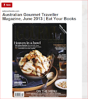
| This one is one of my favorites for a few reasons. I loved how all the focus was on the main image, everything was really dark and warm and the main image was mostly white. For my target audience, moms are extremely busy people and don't have time to read everything on the cover of a magazine, they just want a quick find, so the image is so important because it really makes or breaks it for the consumer. |
Both of these covers are an idea of how I want my front cover to look. They both keep things very simple and to the point with subtle yet powerful elements that speak to my consumer. Since I am doing a food magazine, I need to make sure my main image is as appetizing as possible, to the point where peoples mouths are watering just looking at it. So throughout the first part of my design research, I learned that all the elements have to work as a unit. Also, font color, size ,and bolded letters make a huge impact on the front cover. Since, I am targeting on the go moms, I want to include words such as quick, easy, 5-minute, etc. in my cover lines (bolded).
Source cited:
"FOOD MAGAZINE COVERS." Pinterest. N.p., n.d. Web. 12 Mar. 2017.

No comments:
Post a Comment